

B r i g h t
Second version. A CSS file is available here: http://www.operajournal.com/skins/styles/mime.zip
Description
Second version. A CSS file is available here:
http://www.operajournal.com/skins/styles/mime.zip
Screenshots
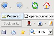
Comments (19 on the original page, latest shown)
Download
Works with Opera 7 or later.
About this skin
| Downloads | 993,053 |
|---|---|
| Original page | Internet Archive |
All versions
- noname-2_0-2.zip 250 KB
- B r i g h t.zip 250 KB
Hola
So far this skin is my absolute favorite. I've tried several all skins, but I believe this one to be the best. It's lite, simple, and with the icons set to small it has a zen-like quality. Some of the skins try to dazzle you with super gradient graphics and shading and excessive colors which to me, just takes away what opera is suppose to be--simple, small, and fast. Even the standard default opera skin is a little to "done-up" for my taste. Great skin for those who like simplicty. Also, I had opera set to its native skin because I didn't like its default -- too glossy and the icons were too much like stereo buttons--Bright was, neat and clean, and good on the eyes. (not really what expected considering its called bright) I really like the Ariana 3-3 skin also, but Bright continues to be the one I use since I downloaded it. Wonderful skin! Great job!!
Great skin! Not fond of those flashy color things, I like things clean & simple, exactly like this-one
I'm a new user of Opera...it seems ok!...and with this skin it seems better! Great job...minimal & good looking!
This skin is awesome. its easy, clean and looks perfect. if you like animation use regular buttons if you like minimalistic skins use the small ones its great :-)
nice simple functional skin. one problem - the white inactive window tab confuses. White is a strong color, never assotiated with an inactive window. Have to reopen the tabs that i stupidly close - thanx to opera, this is easy to do! other than that, my favotite Opera skin, cheers! :-)
I have tried many different skins but haven't found any better than this.Bright is definately the skin for me.Thanks Jenne,you have created the most clear and beautiful skin for Opera!
Nice skin, Jenne! Gr8t job...
I forgot to add the stars.. originally 4, but..
The tabs are looking very good. :thumbsup:
Nice and clean. I like the screen space it saves. The icons are cool.
This skin is so lovely, I doubt I will change it ever!
This is the best opera skin that i have seen.It's simple,clean,beatiful and with an artistic touch.Thanks Jenne,i really like it.
I have tried many skins and a few look good for a while but this is the skin I keep returning to. Some skins are spectacular and draw your attention away from the browser. Bright doesn't do that. It is clean and simple and it just looks good. What else do you need from a skin?
Just a little info that 'Bright' is going to be updated for 7.5 soon! ;-)
try few days, you'll love it...
Thank you for this optional skin for Opera. I am a new user and was not impressed with the oversized native skin. Those arrows at the top of the page were frightening! This is much more subtle and not overbearing. Thanks again...jeb
My favourite skin. It''s simple but not boring I use it with small buttons. Thanks for this one Jenne