

Black Aqua V1.2
A Aqua skin in black for Opera >7.54 incl. 8.0b*Update V1.2*Inserted the missing Save Button param for Version 8.0b*Update V1.1*Fixed a few minor graphic bugs
Description
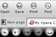
A Aqua skin in black for Opera >7.54 incl. 8.0b
*Update V1.2*
Inserted the missing Save Button param for Version 8.0b
*Update V1.1*
Fixed a few minor graphic bugs
Screenshots
Comments (14 on the original page, latest shown)
Download
Works with Opera 7 or later.
About this skin
| Downloads | 309,024 |
|---|---|
| Original page | Internet Archive |
All versions
- Black Aqua V1.2.zip 1.2 MB
Very fancy - to me it is luxury for opera
GREAT GREAT GREAT GREAT GREAT!!! ------------------ The yellow hover over color kind of makes it look bad. And the tab is a rectangal, when I open 2 tabs, the one I'm on the rectangel and the other is circal-ish...no problem but it looks bad.
IF it helps, I think it rocks, the end, no buts, no shoes noe nothing. Thanks!
Schönes, geschmackvolles Thema. Danke A nice, tastfully made Thema. Thanks tonda [email protected]
I only have one thing to say about this skin, other than it looks great... The only problem that affects me personally is when you move the PageBar to the bottom, the tab text is white... i moved the page bar around and the bottom is the only place where this happens... If anyone knows how i can fix this please give drop me a line [email protected]
hello punks
The degradations are well made, nothing except the "Save" button is missing. this may very well be one of the best skins ever made for Opera
Okay...it's got some bugs. However on the whole I am lovin' it. Give us an update ASAP! Look at some of the Longhorn Alternative skins for Maxthon and Firefox ( as if you haven't already) Your offering is much appreciated-- thanks.
Looks good, nice and simple, but you are missing a "Save" icon.
I really like how this skin looks, although for me it is a little glaring for my taste or something else like that.
Quite nice. Stylish. Sweet & Simple. Unobtrusive. ....I likes it!
Looks good in Mac OSX! Thanks
Good, very. Except that there is no difference between big and small icons Plus (actually minus) fonts are white on almost white tabs.