

Breeze II V4.21b
A very screen-space efficient and elegant/minimalist skin. Fully updated for V8.x — See here for more details. 05.05.05: Minor updates...
Description
A very screen-space efficient and elegant/minimalist skin. Fully updated for V9.x —
See here for more details.
29.06.2006 ― small fixes
Screenshots
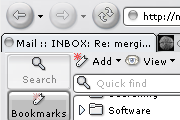
Comments (69 on the original page, latest shown)
Download
Works with Opera 7 or later.
About this skin
| Downloads | 818,449 |
|---|---|
| Version | 4.21b |
| Original page | Internet Archive |
All versions
- breeze_ii_v4_21b-4_21b.zip 227 KB
- Breeze II V4.14.zip 215 KB
- Breeze II V4.0.zip 240 KB
- Breeze II V3.8.zip 238 KB
- Breeze II V3.6.zip 264 KB
- Breeze II.zip 225 KB
+1
Standard OK, Cancel and other form buttons and things like that don't integrate very well with this great skin.
Nice stuff, but the "close tab"-x looks really shitty...
Thank you very much for creating a skin that saves me screen space.
You should do something about the fact that with the "close buttons on each tab" option disabled, there's no way of knowing which tabs are locked. Maybe a color change on the tab or something would be a better way to show it without it having to depend on another option being on. Most skins use a small 'lock' icon, usually transparent, that sits behind the tab title on the right side. I strongly advise you to implement something like this soon, as the fact that middle-clicking tabs closes them makes the close buttons on each tab pretty pointless. Otherwise, I love the skin--this just irks me, though.
The "close" buttons on my tabs on my laptop (Vista) are very small, but they're a lot larger on my desktop (XP) - is this an OS issue or is there some control I can tweak to make them larger on my laptop?
Yes, it is ok to use with 9.5, but some of the new icons will be taken from the standard skin... I will update it once 9.5 goes final
Is it ok for using with 9.5 beta?
Thank you. I like it!
Hi Moose, Breeze is the _best_. My favourite. Wow. Keep your marvellously performant skin au courant, please. And maybe you'd write a description of a kind, so that it will be for us mortals easier to refine it further? Yours, YBK
bookmark panel fixed - sorry 'bout that! I will make the notes icons a bit more clear and update soon...
Bookmark icon missing here too. On the bright side, I used to have visual problems with some input fields (cursor was too close to the filed's border so it looked like not focused) but this new version displays correctly. This is the greastes skin, the one I always stick with. GJ!
The bookmark icon seems to be missing on my panel. Other than that, still one of the best themes ever created. Kudos!
I am very satisfied with this skin except for one small problem. It is very hard to differentiate between a Note that has the originating URL attached (Note icon with reddish text) and a regular note without any URL (Note icon with gray text).
The best for the best! When you can use Mouse Gestures in your browser there is just a few things you need to click in browser itself, so those buttons can be small and compact.
This theme is stylish and compact and has minimal editorializing effect on the web page itself. It is one of the few non native skins that I have in my collection.
Besides being very compact, Breeze II V4.15 has minimal editorializing effect of buttons, boxes and so forth on the web page itself. Since I really don't like a "skinned" web page I usually stick to the native themes except in rare cases. P.S. -- the "fit to window width" icon needs to be skinned if possible.
Because other than being extremely compact, it has minimal editorializing effects on buttons and boxes on the web page itself which is one of my main dislikes of nonnative themes. P.S. --the "fit to window width" icon needs to be skinned.
Absolutely love this skin, even after using different versions of it for months, which tends to highlight any problems with a skin. My favourite.