

Concrete
My first attempt at making a skin... can't really think of anything else to say about it. Enjoy :)
Description
My first attempt at making a skin... can't really think of anything else to say about it. Enjoy :)
Screenshots
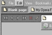
Comments (16 on the original page, latest shown)
Download
Works with Opera 7 or later.
About this skin
| Downloads | 137,715 |
|---|---|
| Original page | Internet Archive |
All versions
- concrete-1_0.zip 321 KB
- Concrete.zip 321 KB
really like this design stands out! Nice feel to it!
really like this design stands out! Nice feel to it!
I Like these flat square grey skins, very pleasant.
Really great! Thanks!
Works great in Opera 9, as well, it seems.
Just fix the white-on-light buttons in the panel bar, and you'll have the best theme by far. Let's just say, this is the first theme that I have elected to keep. Oh, and don't round off the corners of things. Sharp edges just WORK with this theme.
Easily my favourite. I have it in sea style. I had to make a few modifications though. The tabs that need attention are not attention grabbing enough, so I made them brighter, and the Personal Bar buttons look awful with the underlines one.
Wow, awesome skin! My favorite so far. Thanks!
Thank you Master and congratulations on your first skin! It's really nice!
It's nice and simple, and it looks good when colors are applied. (I like Sea myself.) However, I'll agree that more custom buttons, especially the side panel buttons, would be welcome and would push this to a 5 star theme.
The idea is good (simple, clean, minimalist). However, it needs a lot of improvement. In two words, it needs customized buttons. Some small rounded corners won't harm.
BRAVO!
Something very different--I like it. You may want to look at working on colour contrast. Some buttons have dark background with black text; my panel tabs are coming up with white text on light backgrounds. And some preferred personal changes: can you change the yellow hover colour to something else (perhaps just a lighter grey); could the page bar buttons be "flattened," perhaps similar to the personal bar buttons. Those would be great improvements.
Good, but why does the "Mail" icon on the mail toolbar not match the rest?
I like this very much, particularly the preference window design. Fits well with a great many Mac themes and I'm using it as my default skin. Keep up the good work.
Not at all. But icons, seems do not fit quite well.