

Dimmed skin (O8/7.5 buttons)
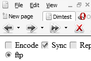
This user interface does not draw attention from web page content. Features grayscale editions of buttons from the standard Opera skin. [20050504; Opera 8.0, changed scrollbar, active push button]
Description
This user interface does not draw attention from web page content. Features grayscale editions of buttons from the standard Opera skin. [20050504; Opera 8.0, changed scrollbar, active push button]
Screenshots
Comments (18 on the original page, latest shown)
Download
Works with Opera 7 or later.
About this skin
| Downloads | 135,550 |
|---|---|
| Original page | Internet Archive |
Very nice!
WOW! It's classy and stylish. This should get the standard skin of opera!!!
could someone gives this skin an update to opera 9.5? i'd love if the new m2 and my.opera sync icons would get 'dimmed' been using this skin since... since it was released
Not only is this skin pretty, but it also is faster than all the other skins I've tried in Ubuntu.
Minimalistic and clean skin. I can't remember when I've started using this skin :-)
Best skin ever! (first thing what i do in a newly installed opera is downloading this skin:)
Nice & clean! For people who hate clunky & tacky skins
Very nice and classy! Love it!
Nok en gang; det beste skinnet jeg noen gang har sett. Alle andre skins jeg har brukt, har vært greie og veldig flotte, men det ender alltid opp med at jeg bytter. Dette har jeg hatt i over ett år nå, og "never looked back" . Tenkte jeg skulle gjøre litt narr av de som ikke forstår norsk... er irritert på alle de portugisiske/spanske/hvafaendeter skribleriene jeg ser rundt om kring
Looks like it's the Opera Standard skin, which I love the Opera Standard skin. I love this skin also. Very nice, I'm using version 8.
The icons are too close to the titles in the tabs Using Opera 7.6 Pr4 There should be a bit of spacing
Very good skin, definately my favourite. I've been using it ever since 7.5 was released. I just started using it for 7.6p4 since I saw it's been updated for it, and so far there's one thing I don't like in the update: The text for tabs in the background that has completed loading are now in a slightly different grey instead of blue as it was previously. I don't like that, it makes it harder to see which tabs have finished when quickly looking up.
Fint minimalistisk skin. Oh yeah.
This is the perfect skin for Opera. Not distracting yet eye-pleasing, not fancy yet elegant. Just a few comments: [1] On update, please let us know what is the change. [2] I love the brackets around the toolbar objects, though the current change of highlighting the menu is also a good one. [3] I don't like the final change in the latest version - which has removed the tab outline. Simplicity is good, but having tabs with a distinct demarkation is also quite essential. THANKS for a great skin. -Ricky
I like it, but the borders around the buttons on the panel selector and the bracket things around the menu items are a turn off.
I think it's oneo f the best skins made. I like the icons. The back and forward buttons. The whole irc theme display as well is also a neat insertion.
i really like it very much. black and white, what i needed when using small icons at 80%, this skin is almost perfect and space efficient.