

Duki
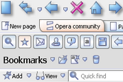
New version of Duki skin. Combination of blue, gray and white. Completely adjusted for M2.20.06.2004 Updated for 7.50+
Description
New version of Duki skin. Combination of blue, gray and white. Completely adjusted for M2.
20.06.2004 Updated for 7.50+
Screenshots
Comments (18 on the original page, latest shown)
Download
Works with Opera 7 or later.
About this skin
| Downloads | 166,397 |
|---|---|
| Original page | Internet Archive |
All versions
- Duki.zip 342 KB
VERY nice,definately among the best!
I rarely like a skin that I like, but this one is nice. The icons are a little small for my 1400x1050 screen, but it's not like I can't zoom them. It's worth a download.
Great Skin. One of the most interesting ones I've seen in a long time. I feel if I had the ability to design a skin, it would have looked something like this.
i chose it for cleanliness and visual clarity and I like it a lot the only jib is that the tab for the foregound window is not highlighted win2000 op7.51
nice dude, very nice
This is one of my favorite skins, but it is still missing the large "Panels" icon. Otherwise, it looks terrific!
Thanks for the great skin. It's my fav. Love the page tabs.
This skin has great contrast and is very easy on the eyes. Crisp and clear.
Clear, crisp skin. Most icons clearly understandable. However, would like to see a variation with better scroll bar visibility and selected window visibility (like Opera Crystal or BEOS). Also, I like the Opera Crystal icons for Fullscreen and Notes better, also Necckep Classic for Show images and Contacts. better.
This is absolutely my all time favourite skin. It's clean, neutral & looks great! Good work & thanks. Hope ya update it for 7.5 etc...
This is absolutely my all time favourite skin. It's clean, neutral & looks great! Good work & thanks. Hope ya update it for 7.5 etc...
I prefer this skin with red colouring----I've tried many, and I urge you to test this one: you might stop experimenting and decide "this is where I want to settle down". It's terrific. Next I'd rate Cocoa (like Camino) and Cocoa navite. Thanks Oper and its crew for giving us such great options.
This skin has a nice crisp feel to it, w/ clean lines. I find the elegance of that very pleasing. The colour scheme is soothing, even when my eyeballs are wonky w/ a migraine! This skin is on my 3-4 skin rotation as the one that is in between each other selection, so i'm using it about 1/2 the time. Will enjoy using it in 7.50 when that goes 'live' and not beta
Nice skin!! How did you make the all the fonts look bigger for all the menus and fav etc.?
Really tasteful! Great sense of color. Thanks for your work. kosmo
I'm using this skin for about a month, and I just could not stop enjoying it
Very pleasent and refreshing to the eye!
reminds me of marina skin. same comments