

MeGuiDdo
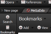
Ready for 9, skin.ini modified : Updated 01.08.2006. Total 152kb, 16x16 icons only, very dark.
Description
Ready for 9, skin.ini modified : Updated 01.08.2006. Total 152kb, 16x16 icons only, very dark.
Screenshots
Comments (156 on the original page, latest shown)
Download
Works with Opera 7 or later.
About this skin
| Downloads | 1,326,680 |
|---|---|
| Version | 1.4 |
| Original page | Internet Archive |
All versions
- meguiddo-1_4.zip 150 KB
- MeGuiDdo.zip 5.3 MB
- [email protected] 5.2 MB
with the dark browsers you need to get the general contrast levels right to get the best fx. i prefer these browsers as they dont hinder the viewing area. if youve not tried one .. then give this a try. you may find the screen is easier on the eyes and the images stand out more too. very slick.
the most appealing part of this skin is the way the tabs are drawn. nice design, small size and easy to navigate. but icons are too small and hard to distinguish. the interface is too dark while white speed-dial background prevents it from being an eye-friendly skin. hope to see an update with better icons and colors.
I only can agree with OttifantSir (and several others ;-P) - up to now in my opinion its the most compatible skin concering the figure/frame. I wonder why its so difficult to find this skin...:-(...So much Users are unwittingly unhappy with the outward apperance of their Opera and in fact they all are unwittingly looking for exactly this skin but because its so hidden they must be content with something boring or general...;-) My only suggestion to the author: More variety and brightness in colors!
This skin has been in the Editor's Pick once. It should never have left that place. It is the only skin I have found that I like. To me, this skin IS Opera.
Excellent work, tried lots of other skins but this one just suits what Opera is all about! Why isn't this skin in the Editor's Pick!!? Come on Mr. Editor, this should be in the Top 10!
One of the early skins that made me really love Opera. Still superb, and the best dark skin I've found. Efficient use of space, elegant, simple. My only preference in the asthetic would be a change of tab shape itself, from the current 45 degree border angle to a 90. Even so, this is clean, beautiful stuff. Kudos!
hoLLY SHOOT!!
The besto of the best"D
Such a beautiful skin. It really is. I only use dark skins. But the icons on address bar(Back, Forward, Home, etc.) and the icons on the side bar could be just a tad bigger. I know that I can choose the icon size in the Appearance window. But when I increase the icon size the tabs increase too. And I don't like that. But, I'm sure I'll get used to the little icons. I'm going to have to, since this is such a beautiful theme. Thank you for your work.
5 Stars! Just updated to 9.50 and its still the best dark skin for opera. Cannot believe that your skins works with all my Opera versions! Great great! Thanks a lot!
Too Good. Been using it ever since I've been an Opera user. Don't even bother trying to find a better skin.
This is the most beauitful dark skins I've seen. I love it. I didn't care much for the icons, and the light text was invisible in the prefernce screen areas. The text this is probably due to my dark linux theme. I need a lighter text as default. Anyway I didn't want to edit my linux theme too much so I decided to edit this skin slightly. I started liking the changes I made. I'm not finished yet, but It's uploaded as "mint". I give you all the credit for the basic design. I hope you don't mind me using your skin as a base. Thanks! Ally
I admire this skin a lot. No wonder it is one of the top rated picks! Thanks!
The most elegant skin i ve ever seen BUT i would like to have a black ( or other color )background for speed dial. Please edit your skin !!!!
I have to be the most indecisive person ever, I tried so many skins to see which I was most impressed with... I kept coming back to this one. This for sure is my favourate, I did put Icon size up to 140% but that's probably personnal taste. I think ipred came up with a good pointer if only to spred out to others tastes, maybe cloning this in to silver or/and white and adding a backround... That eye that comes up in the confirmation box, enlarged my look nice. I think its a top notch skin any way
i added these two lines in skin.ini [Speed Dial Widget Skin] Tile center = window/background.png i just found the key from another skin now I am more comfort
i like this skin very much, it match with my windows xp theme, i loved the tap image, the icons, the small size of the icons make it much simple face with the black, and i can see too many good comments here so that mean people agree with me, or i agree with people, in any case, can i ask if i can change the background colour of the blank new tab? i want to change the white colour, how can i do that?
Best opera skin ever.
This is e x c e l l e n t !!! The most delicate skin i' ve ever seen ! Great tabs , great shape , great shades ! You are a professional ! I hope to see a white or grey version of it and a backround image for speed dial. Please continue to create !
I can only hope the sking gets an update for 9.5(9.2 too). It is IMHO the best skin for any browser, not only Opera. It is so good infact that I skin my OS according to MeGuido