

Simple
a smooth version of Ximple, my 1st skin, which was too rough.
Description
a smooth version of Ximple, my 1st skin, which was too rough.
Screenshots
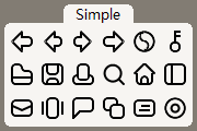
Comments (80 on the original page, latest shown)
Download
Works with Opera 7 or later.
About this skin
| Downloads | 886,724 |
|---|---|
| Original page | Internet Archive |
All versions
- simple-20_0.zip 58 KB
All scary maze games collection at scary-mazegame.net
Love it
The best skin ever, you did a great job.
Hi Serafins, Hope u are well. Like to learn how to make icon size smaller. Using OPera Next 12.50 - 15.46 NO problemas so far. had a look under Skin.ini and couldn't find the "%" which once was there ( sure Opera Next took it away ). Could pls educate me on it. Best
Íconos muy sencillos y limpios. Me gusta mucho.
Thank you very much for something straightforward and user friendly, the other skins are much too busy for my tastes and were making me crazy, great job!
I really hope you'll update this theme to Opera 12!!!
Excellent! I am very pleased this skin:hat:
My only regret is that it took fifteen years to find this hugely talented and sympathetic skin.
I looked at a lot of skins, and this is my favourite. I'd love to see the same skin in darker tones, but I'm definitely sticking with it for now.
this skin is the best one, clear and comfortable.
thanks
i like u:beer:
the best ever. brilliant icons. I don't want to change. if form follows function, which it should, you've done it!
Remove the title bar. Please.
It will be a nice skin if you set transparency. (:
I love this skin, but it has issues with 10.5 http://img87.imageshack.us/img87/8265/clipboard1j.jpg some option texts cannot be read (white fonts on light grey background) I cannot fix it myself
this is lovely, very simple yet beautiful, but I wish it was white on black, not black on white, and also the new tab button overlaps the close tab button on the rightmost tab, which causes me problems. Be nice to get away from stars meaning bookmarks, which has never made sense to me. EDIT: can't read the titles of newly loaded background tabs either, in colourschemes other than 'none'.
Loving the simplicity, and yet clarity, of the icons! With a few little lines you captured the essence of each icon. 8) Like ycc2106 said, though, the folder is a bit odd- not horrible, but odd. Still an excellent skin though. I am using it as of right now! NNN
light and simple very good