

Straccio!
Updated 05.02. Add KCSRC. All illustrations of Kazu Spara.
Description
Updated 05.02. Add KCSRC. All illustrations of Kazu Spara.
Screenshots
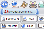
Comments (24 on the original page, latest shown)
Download
Works with Opera 7 or later.
About this skin
| Downloads | 261,705 |
|---|---|
| Original page | Internet Archive |
All versions
- straccio_-1_5.zip 242 KB
- Straccio!.zip 242 KB
the best skin in my opinion... for new users, check the advance> colour options this skin looks great in any colour, just awesome. best compromise between functionality, space, and ease on the eyes. 99% !! triple play!
he
There is no perfect things....
Do you make something wrong on + and - on the folder?
...Security icon doesn't work - doesn't change when on secure site. Also, it's kind of puzzling...just the mirror image of the graphics toggle icon.
...Security icon doesn't work - doesn't change when on secure site. Also, it's kind of puzzling...just the mirror image of the graphics toggle icon.
Open Mail panel and try a connected newsgroup, and scrolling on list window works to download body between "check/send" and "stop" on the toolbar, i.e. by scrolling with down arrow key, when switching from "check/send" to "stop", the panel window rolls. This doesn't happen in *standard skin* in 7.5 beta 1...
Great skin ! Very beuatiful style ! Nice job man
Really good skin.
It's okay, but the buttons are a little too loud for me, and it's hard to tell what some of them do just by looking at them.
Expander on personal bar doesn't appear, but very nice skin
Looks pretty nice. Doesn't mesh as well as it could with the Keramik style of KDE though. The tabs don't look like keramik tabs, they look like keramik window decorations. hmm. Toolbar gradient doesn't stand out as much as on KDE apps either. Also, the colors don't quite match (no surprise there, and not your fault) Can change them by using a different color scheme though, which leads to my question: is it possible to apply a color scheme without changing the color of the icons? THey are quite lovely as is Thanks for your work!
half of the icons for contacts are identical? The rest of the skin is very imaginative, and it looks great. It's just the contact icons that seem out of place.
Blue 2003 was my previous personal favorite but I think this one may become numero uno.
Hey Lars, looks like it's time to pick up the glove, isn't it?
Best skin I''ve seen in a long while Look forward to see more from you
I like this skin a lot! Keep up the great work! Only issue I have is that the page tabs are designed for a top position only.
Very nice. Wait for more Just one thing, 'Hotlist' icons are not quite fit/good.
account selector dosn`t display for me but as mentioned in my previous review nice skin.