

Tango CL
GIT CL is the new Tango CL. \\ GIT CL is a GNOME theme doppelganger feat. Tango compliant icons and the likeness of Clearlooks GTK .\\see gnome.org v.2.22 for the original source and inspiration ...
Description
GIT CL is the new Tango CL. \\ GIT CL is a GNOME theme doppelganger feat. Tango compliant icons and the likeness of Clearlooks GTK .\\
see gnome.org v.2.22 for the original source and inspiration. \\
June 09: Half-assed attempt at updating for 10.0 beta. \\
The old version of Tango CL is now
here
. It was too much work to get up-to-date with Opera 9.5.
Screenshots
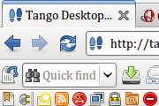
Comments (301 on the original page, latest shown)
Download
Works with Opera 7 or later.
About this skin
| Downloads | 1,511,438 |
|---|---|
| Version | 2.1.0.1 |
| Original page | Internet Archive |
All versions
- tango_cl-2_1_0_1.zip 638 KB
- tango_cl-0_9_91.zip 458 KB
Soft and very pleasant well-formed theme. Great!
Would be 5+ if Titlebar on 11.10 was gone.
Tvery good skin, but the "x" on tab, when the tab is dragged for down and becomes a big one, is only the half of it, almost you cannot click on it
Awesome ! opera 10.10 looks like a real GTK program
Tobias, you rock! Just discovered that Standard skin and most others are missing cut/copy/paste etc. icons (look on Edit menu). Tango has them all. http://my.opera.com/community/forums/topic.dml?id=352201
Many thanks; my skin for years. Only quibble: HTML mail icons . B, U, I make a lot of sense: apply effect to initial, multimode communication; and those dark + orange format icons are, well, not quite the usual unobtrusive clarity.
One of my best skin setups. =D But how about the icons' license? It's the same from the Tango project? (free for use)?
very good work on this. i'm making it my default
Perfect work! This is my favorite skin Originally posted by mnicky: add dots nowai dots look ugly
Yes. Especially after releasing Beta 3, it is time for updating Tango CL Skin ;-) (i. e. add dots for identification of opened tabs that have not been seen yet) Btw, good work! Keep doing... :-)
i think it's right time for update Speeddial and search box must fix after last snapshot...
efekan, thanks glannosg, install the beta of Opera 10, or a more recent snapshot. You can then configure the number of entries on the speed dial. If you notice that the dialog is not skinned like the rest, you a re right. I’ll come to that soon’ish.
how can i put more tabs on speed dial???
Thanks for update. This is my favourite skin Keep working...
This skin is simply amazing! Great job!
"it'll keep improving", I mean
towolf, I appreciate the response. Though I tweaked the icon thing by hand (not so hard actually), it's more visually pleasant to have an icon by default, I just replaced contact_unknown.png with a semi-transparent version of contact_known.png, and it looks way better. Another change I'd to see is the use of a single gradient in a group of toolbars, having gradients for each is not very pleasing in the mail view, for example. Anyways, I know this is a very well done theme (it's the main I use on Opera in Ubuntu), and I expect I'll keep improving
I love this skin, but it is a bit too big. What about a compact version?
armethos, I don’t see that on my system. Are you using something else than Linux? Care to post a screenshot? juanchito, I think I left the default contact icon out because I found the list of emails to cluttered with stuff. I think is basically a transparent "nothing". Interpret it as: "no card, no contact" & "is contact, got card". About the tabs, they looks exactly like Clearlooks, right? This is what I want. And about color themes. I don’t use any.
Great skin, it blends quite well with Clearlooks, some minor details I'd like to be fixed. As d.i.z. explained almost three years ago, an icon for default contacts is missing, it'd be great to have it, maybe just a black and white version of contact0. Another minor annoyance is the lack of good highlighting of tabs and the top of them when using the system palette, it's a bit grayish in my configuration. Anyway, this is a great skin and I hope these problems would be fixed