

The blue Button 1.1
Neutral, economical grey scale Design. For additional Buttons see ReadmeFile
Description
Neutral, economical grey scale Design. For additional Buttons see ReadmeFile
Screenshots
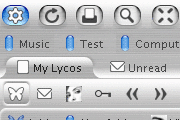
Comments (57 on the original page, latest shown)
Download
Works with Opera 7 or later.
About this skin
| Downloads | 1,059,354 |
|---|---|
| Original page | Internet Archive |
All versions
- the_blue_button_1_1-1_2.zip 341 KB
- The blue Button 1.1.zip 341 KB
I'm new to Opera and the Community. Before I have even figured out what's what yet I stumbled across this skin while browsing and must say... it looks like a keeper. I'm up and running with it.
this skin is realy nice, but 1 bad thing for me as mac user is, that die closed "X" are on the right side und die favicons on the leftside. is it posible to change this? i want "x" left, favicon right. if someone can help me, it will be great.
Third time in, I don't know, ten years I've bit and given Opera a shot.. 'Twas the Charm.. Can't believe all the bells and whistles that are helping.. And the speed, such as it is on *really cheap* dialup, is as good as I can hope for under the circumstances.. With respect to this skin, it put last night's downloading experience over the top.. If for nothing else, it was because Opera as is overwhelms the screen.. This skin draws up all the buttons, toolbars, yetc, and allows my apparently these days smaller than average screen to display as much active webpage as is possible.. Am having one problem and not sure if it is on Opera's end or has something to do with the skin.. Some checkmark toggle boxes are inoperable which means going back to another browser to accomplish certain necessary actions.. Looking forward to seeing all that is yet to be discovered.. Happy, Safe Surfing Out There..
I have been using blue button since the first day I began using opera, and can't dream of using anything else. So, I too would like to see an update so that it works completly with Opera 9.5 Many tiny things changed. To name a few I have noticed: Tabs have a more obnoxious X button to close them. The status bar has the I> On it but the text overlaps it. The status bar is taller then it used to be. The Panel text for icons is missing. Hope an update is comming for either the original author or someone else!
Are there new versions for 9.5 planned? I think there are some very very little problems with this skin and Opera 9.5. Can anybody confirm this?
Came up as Oxid V 1.02 (2)
Hi There is a skin, very similar to this and it's name is I think chosen button. Does Anybody know it? I can't find it.
Thanks Christian. THank you very Much.
Best Work, IMHO!
I really like this skin, it is easy to raed and i also like the semi-rounded tabs...thanks!!!!
hi! ich liebe meinen "neuen" opera browser. danke für den tollen skin. lg aus österreich!
1st post for the community & I'd suggest that this is the proper skin for Opera. Nice work Christ. keep on ..
awesome!!!
This is the best skin I've ever seen! I'm using Opera in all platforms including Mac. It would be nice to make this skin default on Mac platform.
This is the one, beauty. Should be the default setting.
I don't think that's a bug with labels. That's a feature, actually. There are no labels until you put the pointer over, and VOILA! I think the effect is great
I like this skin
Didn't think I'd get help. I just keep having all these problems that no one's heard of. Oh well.
Got a weird problem with skin. For some reason if I enable special effects, the button labels vanish. If I disable them, it's fine.
This is by far the best skin out there! Minimalistic and efficient, but still snazzy. I only wish that the scroll bars didn't have 'the blue button' written in them... it detracts from the overall appearance... but I still make do