

Ubuntu Human
Dapper Retouched with small fixs
Description
Dapper Retouched with small fixs
Screenshots
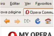
Comments (31 on the original page, latest shown)
Download
Works with Opera 7 or later.
About this skin
| Downloads | 130,740 |
|---|---|
| Version | 1.1 |
| Original page | Internet Archive |
All versions
- ubuntu_human-1_1.zip 344 KB
Good job, works out nicely with the Ubuntu Human orange theme, thanks a lot.
Thank you!
Hi, this is a good looking skin, great, but the panel buttons look a little too blurry to me.
“That says it all ....” well... actually-- though one would never know it-- to give fair praise where praise is due, something i addressed above is precisely that-- what i've read as a bit ambiguous: i've found it difficult to confirm who is the author of which theme, not just in the case of "Ubuntu Human", but in general. I mentioned about Dapper (the O/S distro) dating back to roughly 2006 because, in my logic there, I allowed for charraoalegria to be responsible for "Dapper Retouched"-- though I hadn't confirmed or denounced it-- but in which case a revision of this sort is part of a natural artisitc refinement-- that is to say "Nice work here!". Assuming that case, one might develop an idea about the person behind it: 1.) that the artist is concerned with improving the product of his own work; not self-absorbed, but absorbed in the quality of the piece. 2.) the artist understands himself, without loathing. the work is an extension of himself such that he seems not compelled to move on to something new, but to work in version refinements-- meanwhile, the public might stir in admiration, intrigued to feast upon what may come next in a series of releases-- all based on a consistent theme, and thus a fanaticism is bourne around the product, and the producer as a unit. another important point-- the Customize Opera resources aren't always easy to track. At once i did believe that any of this "Dapper Retouched" series is indeed the work of a singular individual, charraoalegria, then other evidence (or lack thereof) led me to believe perhaps another party was / is involved-- OR, maybe it's a simple case of one person using multiple user-names, or... ;-) no matter. it's all good. regardless of all that, it's nice to have "Ubuntu Human". thanks! best regards, and good luck! -js
"Dapper Retouched with small fixs" That says it all ....
If I used the "Human" theme (as I have, at times, of course), I would use no other theme than this, Charraoalegria's "Ubuntu Human". But I'm forever tweaking the window mgr... (aren't you!?... after all, it doesn't get much easier than X, GDK, Gnome, etc. when it comes to trying on a different hat-- and just as easy, moreover, that any new style of choice might be one's own creation. blah, blah. -- but yeah: definitely Human! More Human than Human ( http://www.last.fm/music/White+Zombie/_/More+Human+Than+Human ). Question: Is this the /original/ Human theme for Opera, a fork, or have you picked-up where someone else left off? just curious. i recall seeing a "Human" theme long before using Xubuntu (... circa 2005 ??). Originally a "Fedora" guy, and --eeek!-- did ride the KDE train as well-- I was definitely using the well-known "KDE Hi-Crystal" theme for a while. It seems the LX'rs are forever seeking a way to improve the desktop, eh? hehe... (wait! oh, i see-- i'm probably thinking of the theme "Dapper", not "Human"... [ so, 2006 would be about right, since Dapper Drake was v.6, and they've been going by year (i.e. Hardy v8.04 was released in the 4th month, 2008. okay. point is: is that /you/ too? cool, either way.) ]) :-) So, why does this theme have so many dedicated fans? I think it's as i was saying 2 paragraphs ago-- it's obvious, really. Because it improves upon the GNOME desktop environment-- that is, IF you're using Opera. (Opera, after all, having an Opera theme, and NOT a GNOME theme, but what?... a WINDOWS theme, of course! But, unlike the author-centric themes we see so much of, a theme like this (indeed, "Human" is also much more worthy of the terminology, "theme", while i've seen more... i dunno what you call it... like drawing on a notebook in study-hall, and trying to get people to dig it??) "Dapper", and "Human" (the Opera themes, not the Linux joint) isn't trying to go all RSS-afied; trying to do, in effect, a "mash-up" of stylistic elements which do not belong together (e.g. tell me you haven't seen "themes" available which must have been finished by merely swapping out the default Op9.5 icons, only to go to great pains to leave the skin otherwise untouched, but for a few "leave my mark" actions which, to my tastes; in my recollection, have only detracted from the beauty of the 9.5 default style. (i.e. This is also known as forcing a square peg into a round hole!) When it first came out, I couldn't believe how great the new Opera 9.5 skin turned out. I mean, i was (and am) really impressed with the sort of "paradigm shift" in their approach to the UI. For example, it doesn't look like Firefox-- moreover, any desktop application you've used before, right? (other than maybe Winamp, or the UI of the Gamer's games) Yet-- i'd swear i've seen FF icons made-to-fit, all mash'd-up-like, into the O 9.5 default... ::cough:: ::cough-'cronix:: [excuse me. something in my throat there...]. I mean, these guys haven't even realized yet that black text doesn't work on a black bg. WTF? hehe... ha! Is it flawed to argue (i.e. who cares, right?) that there's less creativity in throwing in a set of your home-grown media-player icons-- as replacements for those which make "Ubuntu Human" such a 'buntu-friendly skin-- ah, but any creativity, and community contribution is a positive thing, i supposperanto. I still say, however, if youre going to build a Kit-car, then build a goddam Kit car, ya know? But don't try to play it like you did, when all you've done was to throw a set of spinners on your Honda, and called it an achievement! Ya know? ugh! Sorry!@! i had that bottled up, had to get it out. i feel less likely to be crucified for spillin' it here. thanks for reading. nevermind me. nothing to see here. please move along! i couldn't help it: sitting here, trying on all of these %$#@ shoes-- while so much time did pass, with each downloaded, and subsequently having deleted it (blech!)-- it occurred to me: the Air-Jordan's i wore in here are better than the knock-offs these guys are tryin' to put on my feet! what a waste of time that was! haha.. naw. that's harsh. it's not that bad. i'm just trying to make you laugh.... hmm... or /am/ I? (what's that jackass sound?... Eeeawww eeeawww! gotta love the 'web)
http://files.myopera.com/macRоSS/files/скрин.png У меня нету букв в етом меню.
Thanks a lot for this skin, looks great on my ubuntu
integrates into my Ubuntu perfectly. Thank You!
esta genial gracias
This skin allows Opera to live beautifully with ubuntu. Thank you for your efforts.
Much fuzziness all around. You should refrain from scaling the icons at all.
Please accept my praise and thanks for this skin. Since moving from the OTHER operating system to Ubuntu Linux 9 months ago, all of my existing opera skins looked odd against my Ubuntu desktop. I upgraded to Opera 9.50 today from 9.50b and that looked even worse! It sent me looking for another skin. Your's is beautiful and integrates perfectly with my Ubuntu desktop.
Amazing themes
such a clean nice skin! thanks
Nice! I need this for my Opera on Ubuntu.
Like I said, a great skin. I just found one minor bug, though - when I use newsfeeds and unselect any news item, the icons jump up in the toolbar above
Zekton...
Pls tell me - what font use in tabs?