

Yanike's Domyzil v0.8 (Baby Blue Shine)
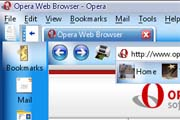
Version 0.8 is here! Use "No Color Scheme" in "Appearance" to see my default look. I'm going for the best skin on Opera! It's a long shot, but I'm ready!
Description
Version 0.8 is here! Use "No Color Scheme" in "Appearance" to see my default look. I'm going for the best skin on Opera! It's a long shot, but I'm ready! http://www.yanike.com
Screenshots
Comments (16 on the original page, latest shown)
Download
This file has not been recovered yet. Do you have a copy? Tell us.
About this skin
| Downloads | 23,685 |
|---|---|
| Original page | Internet Archive |
internetworld7 - Thanks for the clarification on an issue I didn't think existed. I stand corrected.
My bad Yanike. I didn't even know you was a brotha until I checked out your well put together site. In fact I was thinking I was the only Black person in the world who was using Opera! I was just poking fun at you earlier about what I said. Hope I didn't offend you. I can see from your website that your very talented. A true asset to the internet community.
Hey All! I just got my skin posted up on Maxthon! It's definitely my masterpiece skin. Plus! Don't forget that the skins here on Opera are like betas. I was just giving a step by step process. The full set skins will be released when I'm done. Get ready for the future! I have more than just skins planned. Try OS! Checkout my latest skin at http://skins.maxthon.com/?id=167
the skin in his profile seems not to be his Be realistic, your skin for Maxthon, is by far better than those two ones for Opera. Usability is the first objective when designing the skin.
I've seen your skin internetworld7! Nothing to be proud about. You can keep the $1000.00 that someone paid you to not make skins anymore. I've created skins for all browsers and everyone likes 'em. So hate somewhere else!!! If you use Maxthon Browser, checkout my new masterpiece skin -> http://www.winmatrix.com/forums/index.php?showtopic=7012
I'll personally pay you $1000.00 cash if you promise to never create another skin in life.
This one looks better. Nice work!!
Thanks for the update! The icons I mentioned are corrected. Looking forward to future updates - keep up the work on this skin. Its going to be great when its finished.
Icons fixed! I'm working on completing the full set now for Domyzil v1. Enjoy v0.8!
Yes indeed! I'm planning on fixing that as well. The final version will be Dark and the baby blue shine version you see here. I'm gonna release a better one soon! Which will have the icons corrected. Believe me when I say, "Sharp Transparent Effects!". That version will be the last until Opera 9 is released. So, enjoy the lead up to Domyzil 1.0!!!
The toolbar, panels etc background is nice. The 3D effect shines through as intended. What is really needed here though is continuity among the icons\buttons. The mail button appears to be 64x64 pixels while my panels button looks to be about 32x32. All images need to be scaled to be the same size. Once thats done you'll have a very nice skin. See screenshot here... http://www.4input.com/screenshot.png
Version 0.5 is now here for your viewing pleasure! It's still in the works. I just like giving people a step by step process. Hope you all like it and look forward for the next version step towards 1.0. I can't wait for 9.0(Merlin). I'm going to release a new theme for it as well. Happy Holidays!!!
Sorry about that decimal! I fixed some of the bulgy problems. I've only been working on it for about two hours. Believe me, when it's done, you're gonna love this skin.
So far I like it. Like the home button.Like the color in the default theme.
According to what is displayed in my browser, gradients are frightful, colors are too much saturated, and icons are very buggy. Some icons are too big, some too small, moreover there's no one identity for icons, all the icons are picked up from different styles and mixed together, that's a wrong process. Some icons are even images! i had to look one minute to recognize that transfert image is a satellite. Those kind of image are far too complex to be icons! There are many things to be fixed. It's a nice debut in skinning but you should have waited more time before submit it to the community, by testing it and fixing very obstructing problems. The truth is that no one will use it if you don't fix at least the icons
This is my first skin. Just wanted to go with something different. Tell me if you like!!! http://www.yanike.com