
Feedback Time(line)
Facebook users have had access to the newer Timeline layout for a while, and brands had time to experiment with the layout before applying it, too. What do you think of the design and layout we're working with today? Too blue? Not enough blue? Too human? Not human enough? We value My Opera feedback more than you might think, this is a great time to help shape the brand.
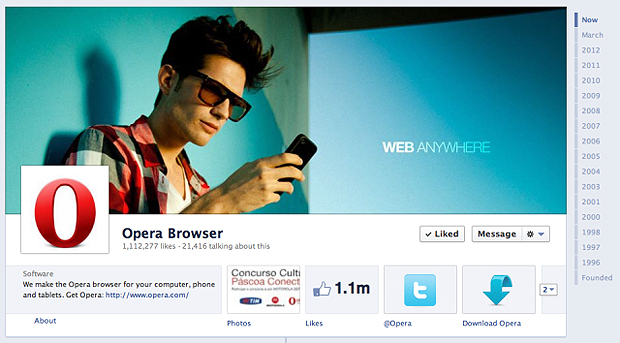
Here's what we're working with right now. Let us know your thoughts. Or you can download and edit a copy and post it in the comments, too.

Readers' comments 43
Left under the original article, as archived.
About this article
| Published in | Choose Opera |
|---|---|
| Date | April 9, 2012 |
| Author | .ed |
| Tags | facebook, design |
| Original | Internet Archive |
CoyoteeMonday, April 9, 2012 11:15:07 PM
KarenMonday, April 9, 2012 11:29:25 PM
UnrealmirakulixTuesday, April 10, 2012 12:32:04 AM
LuchsTuesday, April 10, 2012 12:41:13 AM
PengeTuesday, April 10, 2012 12:48:11 AM
nayTuesday, April 10, 2012 12:55:25 AM
Agung DkidTuesday, April 10, 2012 1:27:10 AM
Charles SchlossTuesday, April 10, 2012 4:31:34 AM
nice 1.1 million
SaskatchewanTuesday, April 10, 2012 8:23:03 AM
Originally posted by Kr0pr0X:
Patrick O'ReillyTuesday, April 10, 2012 8:43:36 AM
UnrealmirakulixTuesday, April 10, 2012 9:12:07 AM
PS: Thx for this smiley, didn't know this one. Shame on me... ^^
D1sasterp1eceTuesday, April 10, 2012 10:32:56 AM
Originally posted by Penge4:
OH GIVE THE MAN A BLOODY MEDAL!
No, seriously, there's something wrong with Fb and Opera and you all know it.
Other than that, the design is fine.
UnrealmirakulixTuesday, April 10, 2012 10:45:55 AM
Originally posted by rationz:
more red, not more comic.Yeni SetiawanTuesday, April 10, 2012 11:00:26 AM
Andylee SatoTuesday, April 10, 2012 12:07:21 PM
2nd) more red
3rd) apart from design: less one-way-communication. start communicating by reacting to comments, answering questions and so on.
TanelTuesday, April 10, 2012 1:58:42 PM
Found a few typos, in 2000 and 2005 it says "trail" in places where it should probably be "trial"?
In general, I'd suggest to make it more visually captive (LOVE those screenshots!) and perhaps target the timeline content a bit wider than just Opera's own history. You could include interesting facts about the development of browsers, web standards, CSS, people, trends, companies et all — in this way you could turn the Opera Timeline into an interesting presentation of "The History of the Internet" that could potentially be interesting content to a much-much wider audience. I don't recall anyone doing it yet with FB, so there's a massive opportunity window wide open right in front of you.
albisdgTuesday, April 10, 2012 2:35:50 PM
http://www.hyperarts.com/blog/how-to-create-a-cool-facebook-timeline-cover-photo-and-profile-picture-combo/
CoyoteeTuesday, April 10, 2012 4:36:57 PM
D1sasterp1eceTuesday, April 10, 2012 4:40:46 PM
Originally posted by jorjy27:
It's not like it isn't already discussed... http://my.opera.com/community/forums/topic.dml?id=1064892Juniôr TlhapéTuesday, April 10, 2012 7:40:56 PM
Rodrigo HeLoTuesday, April 10, 2012 8:06:41 PM
NimeshTuesday, April 10, 2012 8:48:28 PM
Add the screen from the Opera Mini global usage activity visualization (link) behind the web anywhere text.
Phillip Robert O'ConnerTuesday, April 10, 2012 11:37:14 PM
CoyoteeTuesday, April 10, 2012 11:49:16 PM
Alain6Wednesday, April 11, 2012 2:03:39 AM
HanvordWednesday, April 11, 2012 3:36:36 AM
NadelWednesday, April 11, 2012 8:24:53 AM
SaskatchewanWednesday, April 11, 2012 11:09:06 AM
Alain6Wednesday, April 11, 2012 11:13:55 AM
ChristophWednesday, April 11, 2012 11:19:31 AM
In red it just looks too monochrome IMHO
d4rkn1ghtWednesday, April 11, 2012 3:38:44 PM
Originally posted by Saskatchewan:
UnrealmirakulixWednesday, April 11, 2012 5:59:05 PM
Originally posted by d4rkn1ght:
Alain6Thursday, April 12, 2012 3:57:02 AM
Alain6Thursday, April 12, 2012 5:00:14 AM
Rodrigo HeLoThursday, April 12, 2012 6:56:23 AM
SaskatchewanThursday, April 12, 2012 9:30:38 AM
Originally posted by Unrealmirakulix:
A little more whitehttp://files.myopera.com/Saskatchewan/opera/opera_facebook_white_icons.jpg -
BoshnjakiThursday, April 12, 2012 9:38:43 AM
OPERATORFriday, April 13, 2012 9:02:14 PM
ChristophSaturday, April 14, 2012 8:15:26 AM
Originally posted by sinojersey:
+1Cutting SpoonSunday, April 15, 2012 1:07:22 AM
MarkusSunday, April 15, 2012 9:14:32 PM
X Ska Maniax SetiawanMonday, April 23, 2012 1:08:28 PM
ahoj1234Wednesday, April 25, 2012 6:31:25 AM