
Replacing our office sign - you decide the new design
We're updating our outdated Opera office sign with something new. For this process, we'd like to get your creative input. Take a look at our sign below and let us know if you have any ideas for a new design (download picture for editing). We'll put the best idea into production! 

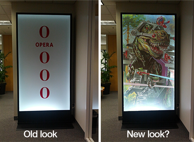
Is this the style we should go for? Maybe not, but you tell us!
Readers' comments 49
Left under the original article, as archived; 1 page of comments could not be recovered.
About this article
| Published in | Choose Opera |
|---|---|
| Date | August 1, 2012 |
| Author | Espen André Øverdahl |
| Tags | sign, opera, dinosaurs with lasers |
| Original | Internet Archive |
Andrew NguyenThursday, August 2, 2012 12:19:48 AM
EDIT: The dinosaur one, that is.
slackwrdaveThursday, August 2, 2012 12:28:08 AM
Barraco Mármol JerónimoThursday, August 2, 2012 12:29:14 AM
if opera was a dinosaur it would have lasers, and probably be a jedi.
Kyle BakerThursday, August 2, 2012 12:30:30 AM
RachelThursday, August 2, 2012 12:56:47 AM
Jean ChicoineThursday, August 2, 2012 1:05:50 AM
Keep it simple. Keep it instantly recognizable.
eonblueThursday, August 2, 2012 1:37:44 AM
Lucas da Costa DantasThursday, August 2, 2012 2:49:23 AM
With a default small one at the bottom corner written Opera Software.
asifumarThursday, August 2, 2012 2:58:45 AM
Fathima Rifqa GhaffarThursday, August 2, 2012 3:13:15 AM
/\/\€€TThursday, August 2, 2012 3:58:36 AM
catseThursday, August 2, 2012 4:14:23 AM
make a single and recognizable logo, but just a O , in 2D ,3D if you want
Mağruf ÇolakoğluThursday, August 2, 2012 10:32:38 AM
earth01Thursday, August 2, 2012 10:57:53 AM
http://files.myopera.com/earth01/files/operator.png -
iamducidolThursday, August 2, 2012 11:42:55 AM
http://files.myopera.com/iamducidol/albums/12357782/logo.jpg
OttoThursday, August 2, 2012 1:34:51 PM
Originally posted by iamducidol:
This is on the right track! --> A recognisable logo. --> A bokeh photo - http://en.wikipedia.org/wiki/Bokeh --> A slogan or buzzwords; maybe. You could always let a photo do the story telling. --> Perhaps these ten principles for good design could be applied visually? - https://www.vitsoe.com/gb/about/good-design The old looks very dated. Bad brand/product impression. The new looks random. No idea what the connection with Opera is (Mozilla?). Why not use the great animals used in the latest Opera versions (Kestrel, Barracuda etc) and do a series of posters you can cycle inhouse and elsewhere? I love sci-fi and am not sure an Iron Man like character would work, as Opera feels more like a smooth classy agent, like James Bond. My two pennies.Odin Hørthe OmdalThursday, August 2, 2012 3:03:18 PM
Just use the not-ancient logo. Simple and nice.
SahalkabeerThursday, August 2, 2012 4:27:46 PM
catseThursday, August 2, 2012 4:52:54 PM
DanieleThursday, August 2, 2012 5:36:22 PM
https://dl.dropbox.com/u/21949779/IMG_20120801_164149%20copy.jpg -
allyysaThursday, August 2, 2012 6:02:30 PM
a phrase used for people who experienced the dinosaur.
at moments of this logo, you're ambitious in this area.
You can add items a few sympathetic.
good luck
xolaniThursday, August 2, 2012 7:47:45 PM
MichaelThursday, August 2, 2012 9:49:16 PM
catseThursday, August 2, 2012 10:17:54 PM
Keiv M.Friday, August 3, 2012 12:53:11 AM
where is the stable browser you guys used to make?
JoelFriday, August 3, 2012 2:56:16 AM
Jean ChicoineFriday, August 3, 2012 3:36:24 AM
Originally posted by jgm21:
This is good, this is very good. The best idea I've seen so far. Simple, recognizable, easily identifiable. Nice job, Joel.xolaniFriday, August 3, 2012 5:09:13 AM
AbandonShip?Friday, August 3, 2012 11:36:36 PM
Originally posted by jerobarraco:
And add "interphase torpedo" launcher ("USS Voyager") & style it like this _multi_directional firing launcher of "Deep Space Nine" on sides ^^ http://www.youtube.com/watch?v=d4GpWd7sZXw & http://www.youtube.com/watch?v=hsqhZTvIT0k
OPERA: Armed to the teeth
AbandonShip?Saturday, August 4, 2012 12:03:07 AM
Originally posted by darklink88:
Nice! -> Don't feed the fox
or: No blinding polished Chrome-head -> metal-head is OK http://twitter.com/chrisdavidmills
JoelSaturday, August 4, 2012 4:58:00 AM
Originally posted by ZakMichigan:
hehe thanks...
catseSaturday, August 4, 2012 6:27:36 AM
/\/\€€TSaturday, August 4, 2012 10:44:18 AM
catseSaturday, August 4, 2012 12:19:00 PM
seems good
Cecilia PurgatoSaturday, August 4, 2012 7:29:08 PM
Originally posted by iamducidol:
I like that one with the leopard, saying "faster & stronger" (even though I'd change that "stronger" with "better")... =)Edwin WilcherSaturday, August 4, 2012 8:58:05 PM
Rafael LuikSunday, August 5, 2012 12:27:49 AM
Originally posted by darklink88:
Perfect! hahaCoyoteeSunday, August 5, 2012 5:43:42 PM
d4rkn1ghtMonday, August 6, 2012 12:58:13 AM
catseMonday, August 6, 2012 5:37:15 AM
d4rkn1ghtMonday, August 6, 2012 12:41:27 PM
Originally posted by opcat:
Yeah.
catseMonday, August 6, 2012 2:51:07 PM
Richard ArthurMonday, August 6, 2012 7:20:40 PM
Richard ArthurMonday, August 6, 2012 7:20:45 PM
CoyoteeTuesday, August 7, 2012 3:18:25 PM
CoyoteeTuesday, August 7, 2012 4:31:03 PM
Richard ArthurThursday, August 9, 2012 4:52:35 PM
Suleman MughalSaturday, August 11, 2012 5:54:30 AM
nguyendinhtuan-operatorMonday, August 13, 2012 11:56:04 AM
http://my.opera.com/nguyendinhtuan-operator/albums/showpic.dml?album=12438872&picture=161924332
http://files.myopera.com/nguyendinhtuan-operator/albums/12438872/Opera-office.jpg