
Developers › A Journal from Behind the Trenches
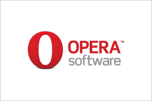
New logo for Opera Software
The Opera icon was updated for Opera 10, and now the company logo has received a facelift as well:
Head over to the press resources page for various other formats and colour combinations.
I'm sure that some people will hate it, but I guess you can't please everyone
Head over to the press resources page for various other formats and colour combinations.
I'm sure that some people will hate it, but I guess you can't please everyone
Readers' comments 31
Left under the original article, as archived.
About this article
| Published in | A Journal from Behind the Trenches |
|---|---|
| Date | October 26, 2009 |
| Author | Haavard |
| Tags | opera, logo |
| Original | Internet Archive |
AuxMonday, October 26, 2009 3:51:15 PM
FransMonday, October 26, 2009 3:53:16 PM
Sami SerolaMonday, October 26, 2009 4:10:07 PM
TreeGoMonday, October 26, 2009 4:26:41 PM
CharlieMonday, October 26, 2009 4:41:15 PM
Steven GIbbsMonday, October 26, 2009 4:49:40 PM
I like it though
Brian HuismanMonday, October 26, 2009 5:31:17 PM
Diego Schild SmithsMonday, October 26, 2009 5:53:39 PM
It's better than previous one.
TeoMonday, October 26, 2009 5:55:44 PM
Rafael LuikMonday, October 26, 2009 8:08:29 PM
-nothing more to declare.
HaavardMonday, October 26, 2009 9:17:14 PM
random414Monday, October 26, 2009 9:22:05 PM
Mağruf ÇolakoğluMonday, October 26, 2009 10:27:16 PM
aFamousMonday, October 26, 2009 10:28:31 PM
Really very nice.
Mağruf ÇolakoğluMonday, October 26, 2009 10:49:20 PM
Yeni SetiawanTuesday, October 27, 2009 12:37:13 AM
Kai OckendorfTuesday, October 27, 2009 5:55:23 AM
TrofTuesday, October 27, 2009 11:16:07 AM
Charles SchlossTuesday, October 27, 2009 12:36:33 PM
AuxTuesday, October 27, 2009 1:04:53 PM
d4rkn1ghtTuesday, October 27, 2009 10:30:23 PM
Also, the Opera Web Mail site need a major change from the old logo to new.
Charles SchlossTuesday, October 27, 2009 11:44:33 PM
d4rkn1ghtWednesday, October 28, 2009 9:08:33 PM
FataLWednesday, October 28, 2009 10:39:17 PM
Now Opera will definetely become Oprah department.
PurdiThursday, October 29, 2009 7:53:07 AM
Originally posted by FataL:
Nonsense. You are just being bigoted and biased because you are allergic to change and improvement.
Using the word "crap" alone shows your irrational, hyperbolic approach to this.
TurinThursday, October 29, 2009 10:20:11 PM
PurdiFriday, October 30, 2009 9:41:22 AM
Originally posted by Turin:
Except overstock is italic, much thinner, and without details/gradients... Actually, it looks nothing like Overstock's logo.
AuxFriday, October 30, 2009 3:04:12 PM
If you compare it with previous version then you should notice THREE main differences:
1. Opera software font changed. I don't like capitalized E in new font, but this is the only weak point in new font - old one was worse comparing to new one.
2. Red O is changed. It has more weight now and looks more stable. Old one was like taken from Times New Roman and TNR is a very ugly font. New one is GREAT!
3. Shadow is reworked. Old one was very accented and placed under stupid angle. Actually that was really ugly. Old one would be much better without poor shadow. So now it is removed! Hurray to the designer(s)!
And new logo looks great in every situation - icon, web, print, coloured, monochrome, etc. It is very good from a designer's view (even though I'm not a designer actually, but I know a lot on the matter).
TurinFriday, October 30, 2009 9:42:57 PM
AdrianPMSaturday, October 31, 2009 2:46:12 AM
JaredSaturday, April 10, 2010 5:43:44 AM